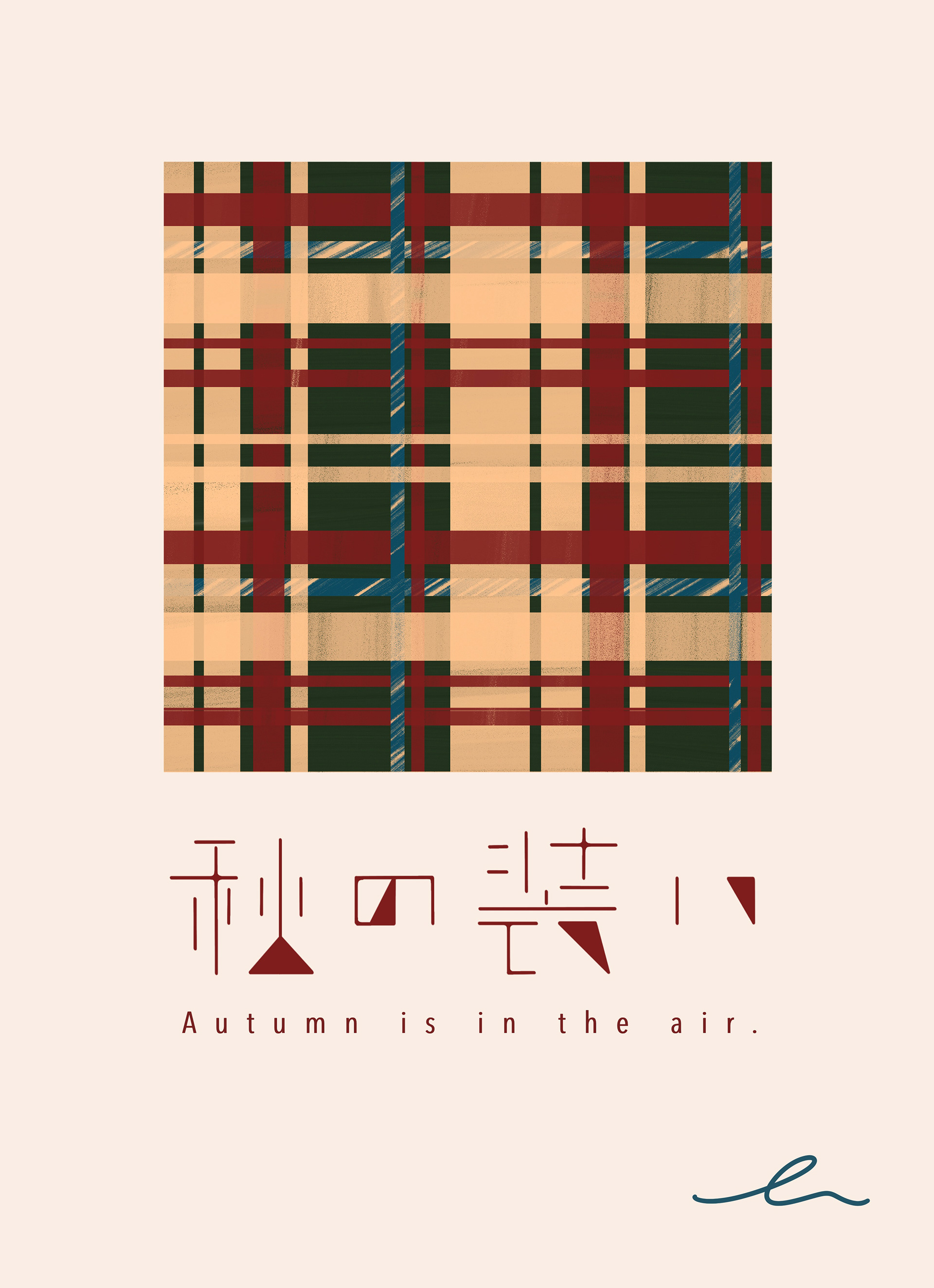
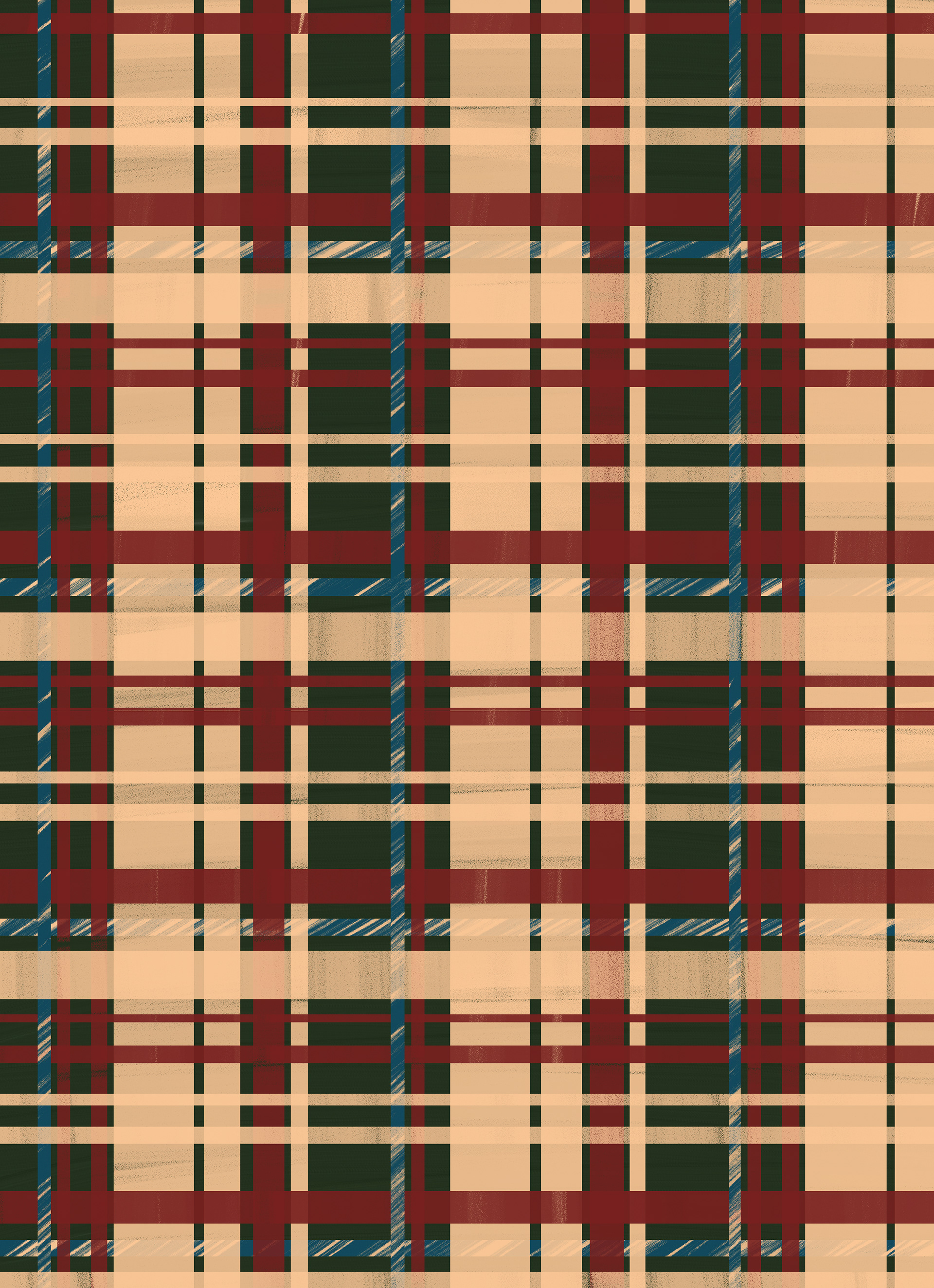
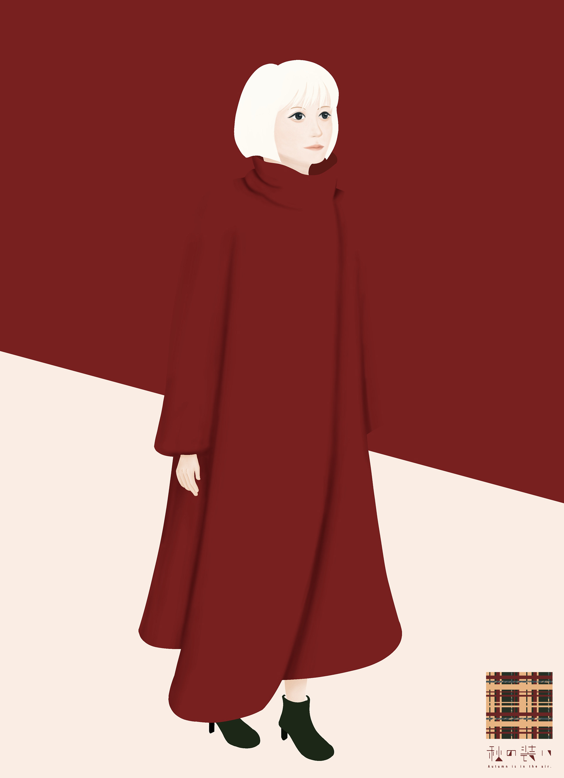
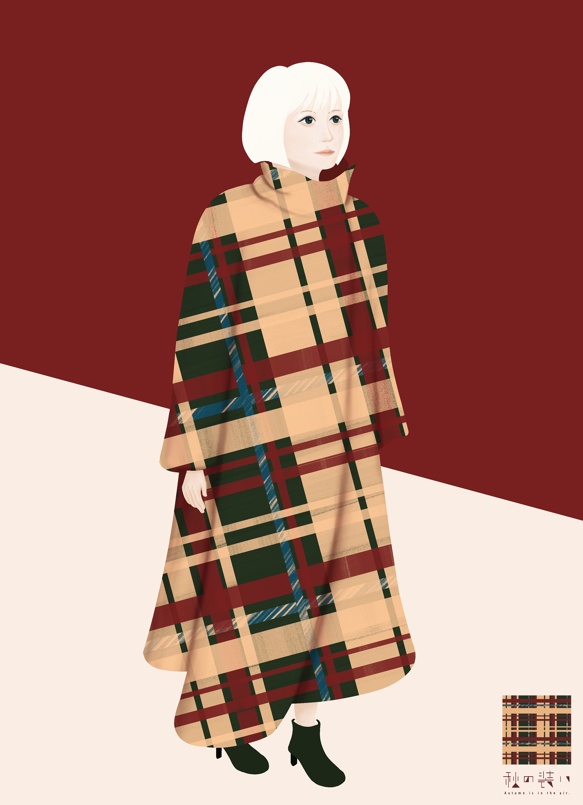
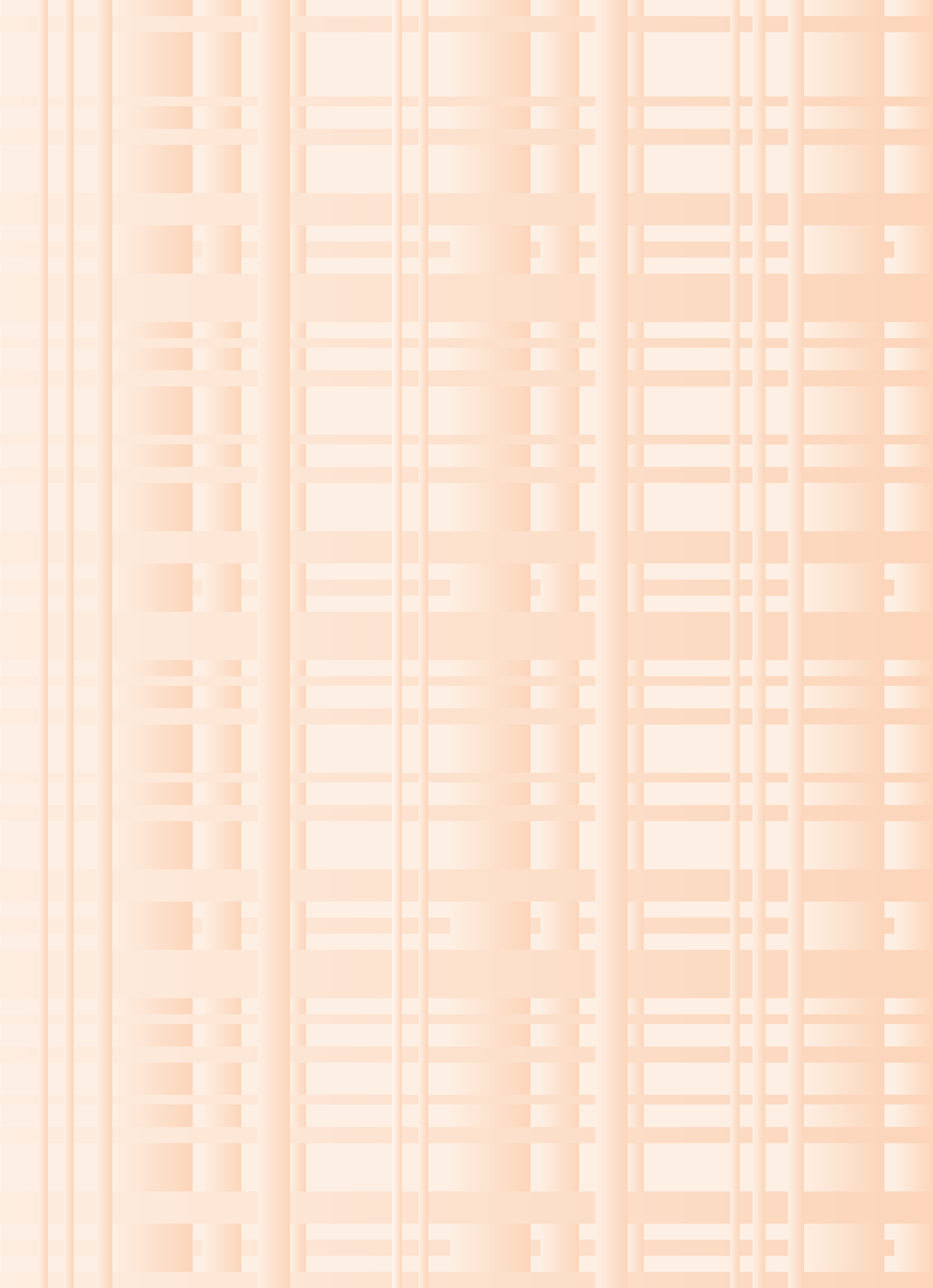
“Autumn is in the air.”
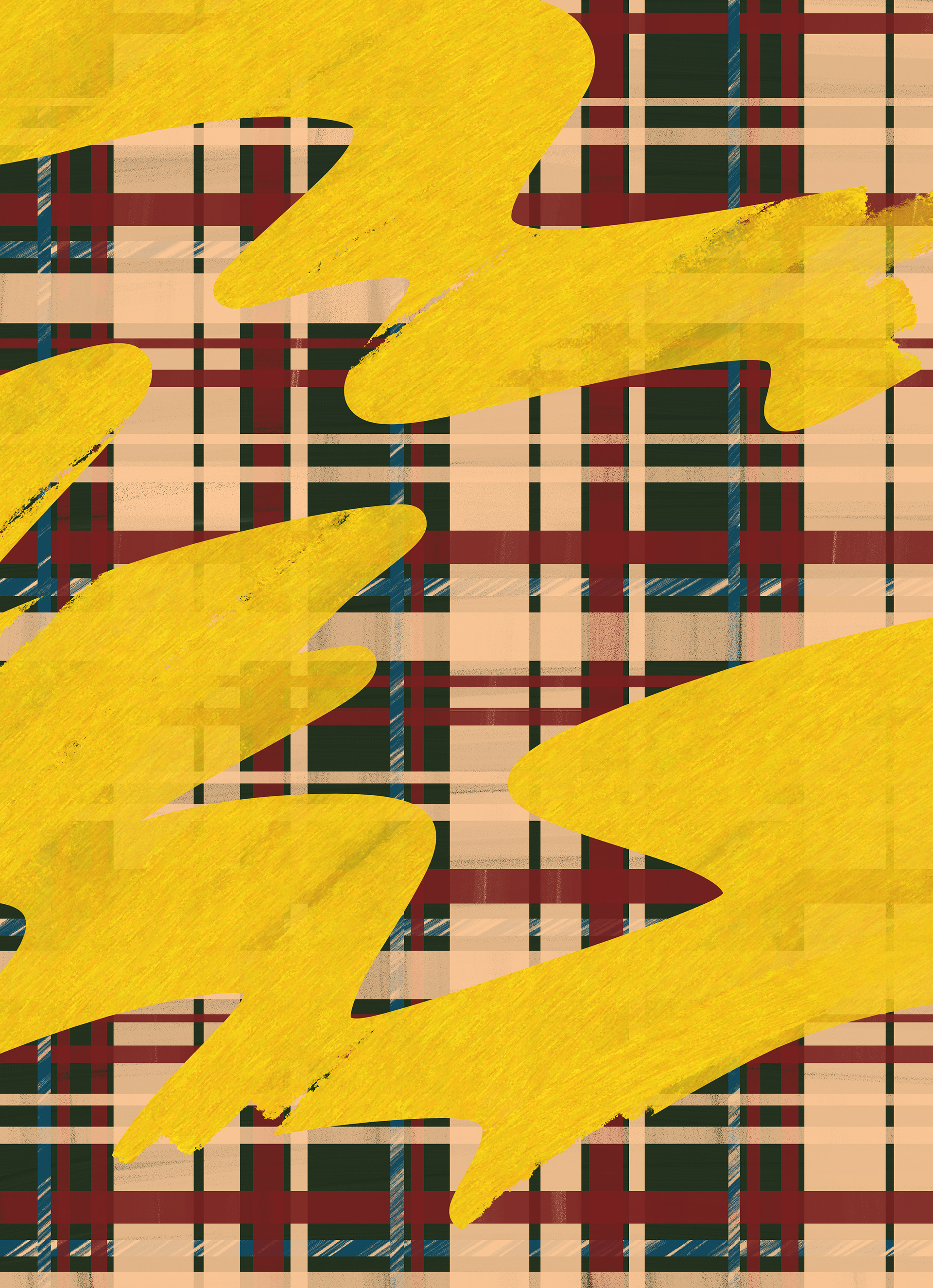
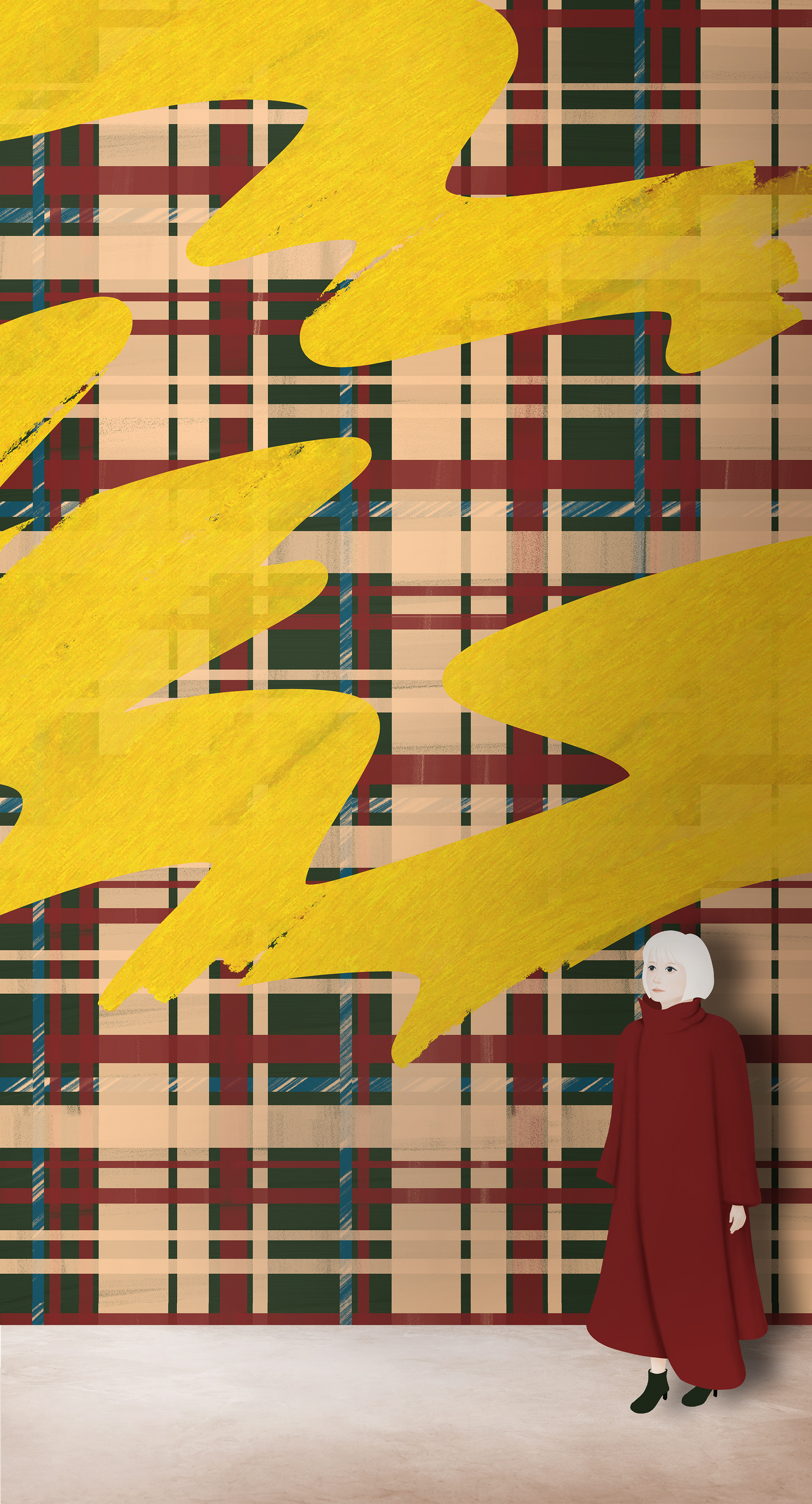
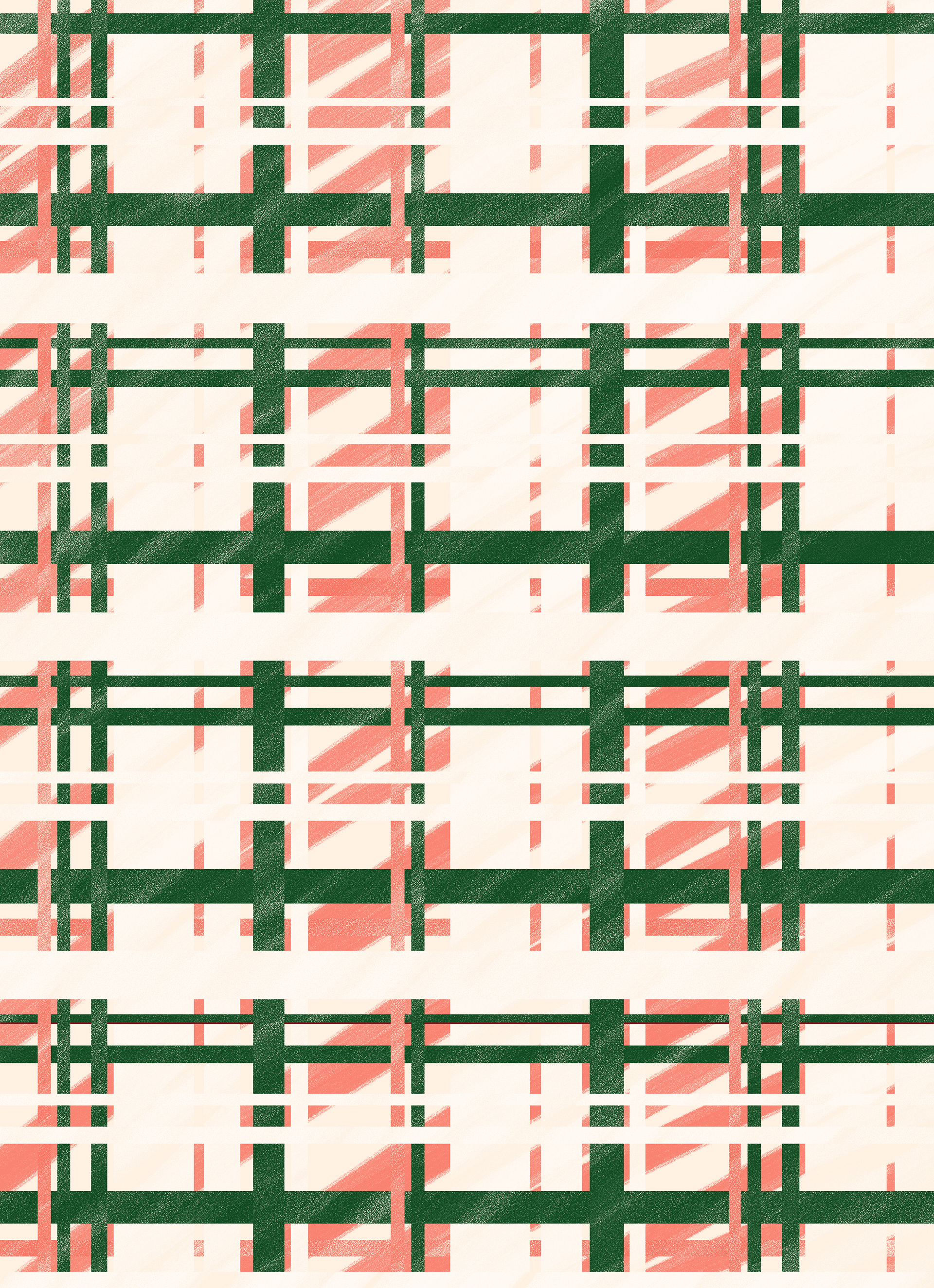
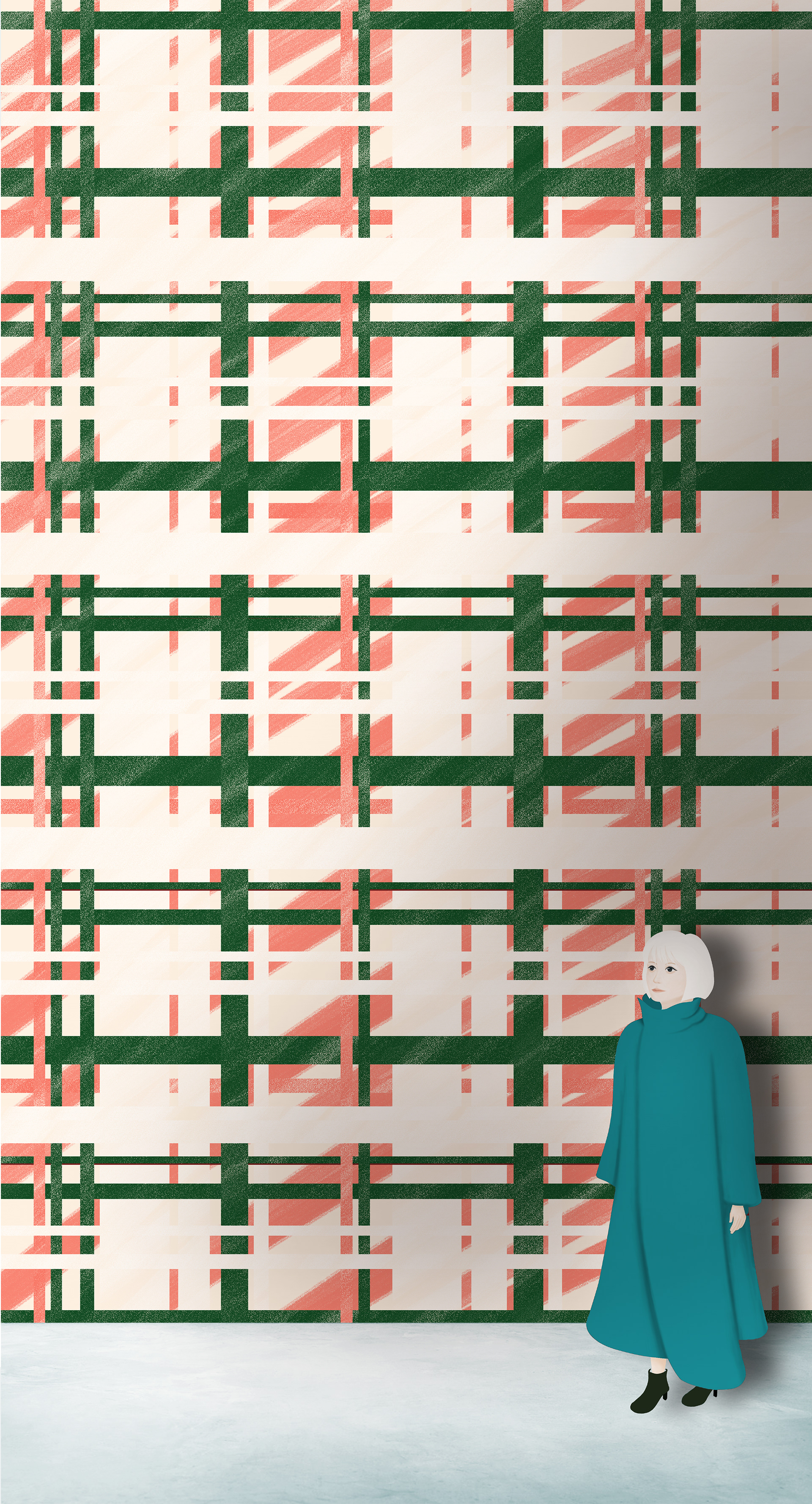
"Autumn is in the air." is an apparel store based on the concept of enjoying the serene atmosphere of autumn all year round. In the logo, triangles resembling autumn leaves are scattered throughout the logo. And while using many straight lines, the details are rounded to create a logotype that is reminiscent of a gentle forest. The symbol mark is based on a checkered pattern that evokes autumn, with blue as accent color. The result is a logo design that can be seen all year round, not just in autumn, and also functions as a pattern design that can be naturally applied to store wallpaper, posters, and fashion designs.
“秋の装い”
“秋の装い”は、秋の落ち着いた雰囲気を年中楽しむことをコンセプトとしたアパレルショップです。ロゴマークには、紅葉に見立てた三角形を散りばめるとともに、直線を多用しつつも丸みのある細部とすることで、優しい森を連想するようなロゴタイプとしています。また、シンボルマークには、秋を感じる配色チェック柄をベースとして、差し色にブルーを入れています。これにより、秋のみならず一年中見ても見飽きないロゴデザインとするとともに、店内の壁紙やポスター、ファッションデザインなどにも自然に展開できるようなパターンデザインとしても機能するように仕上げました。