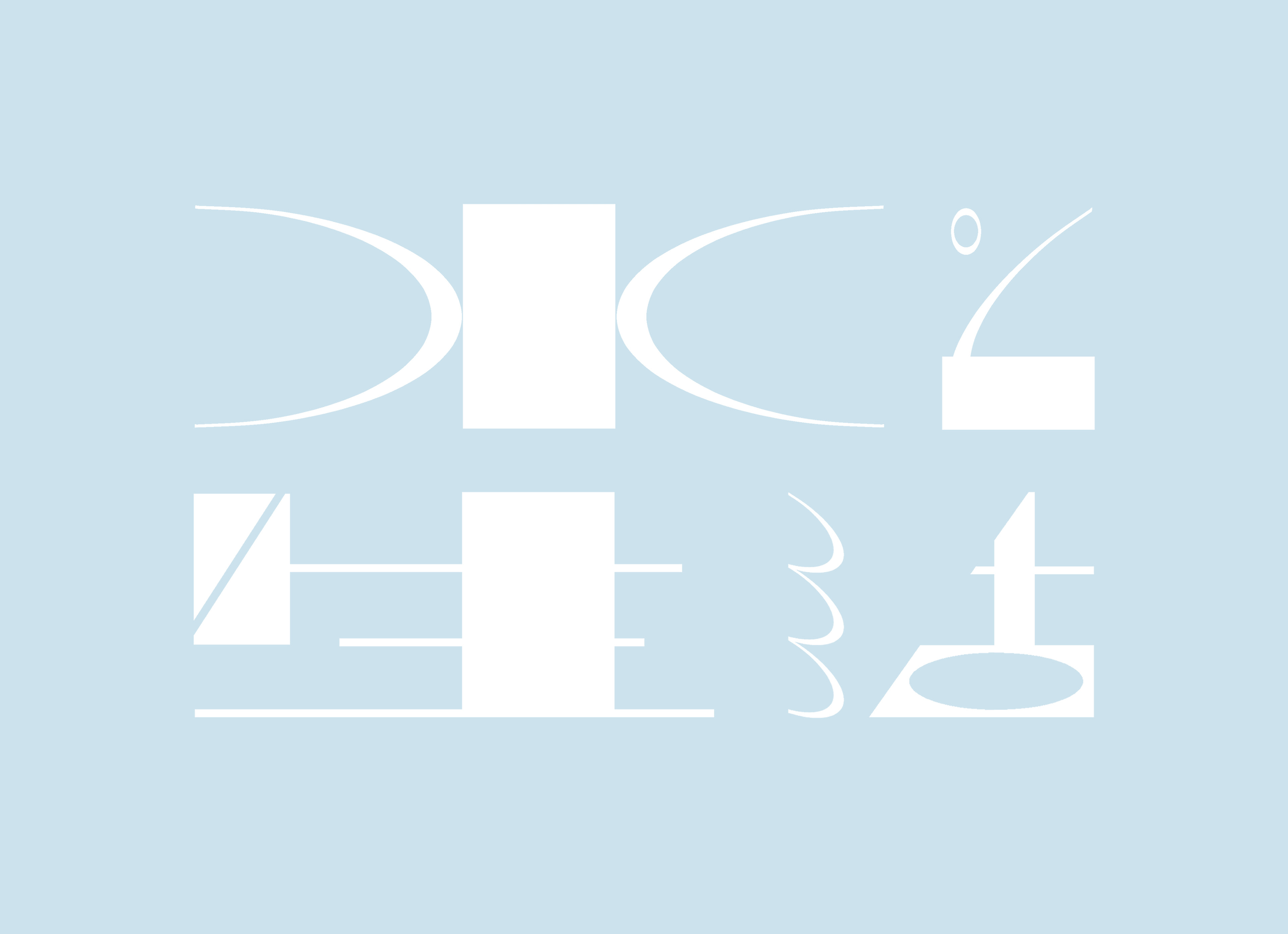
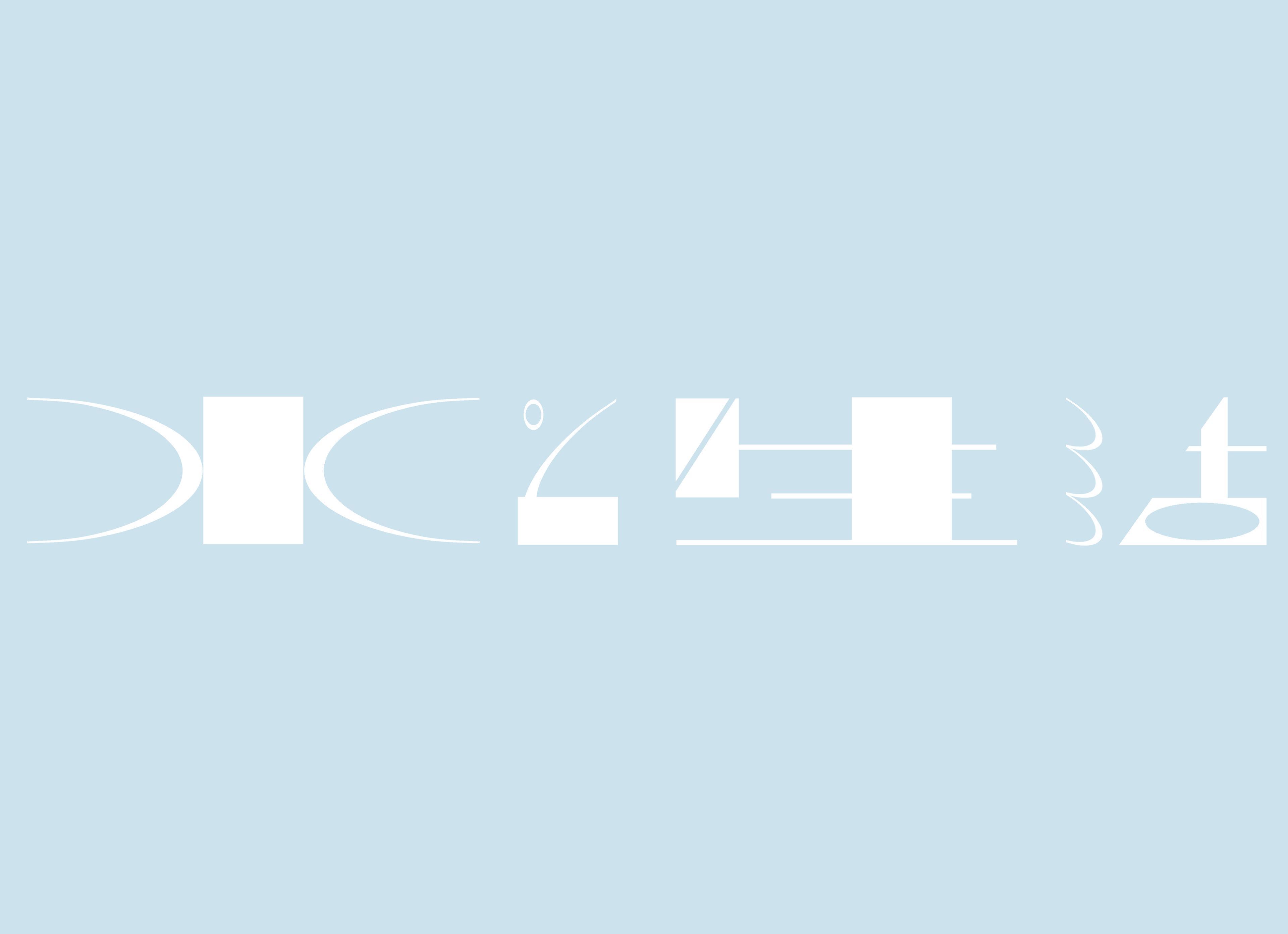
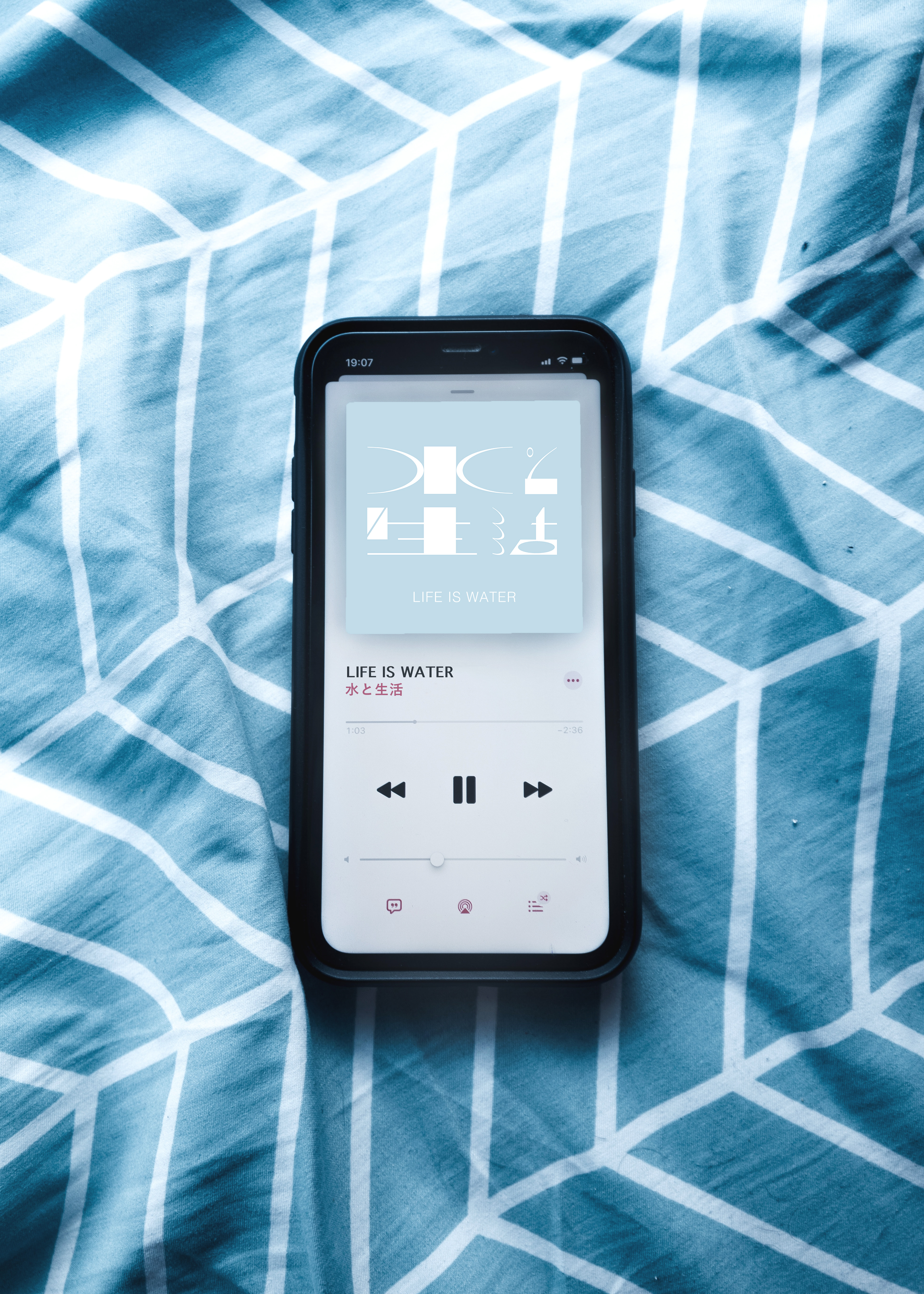
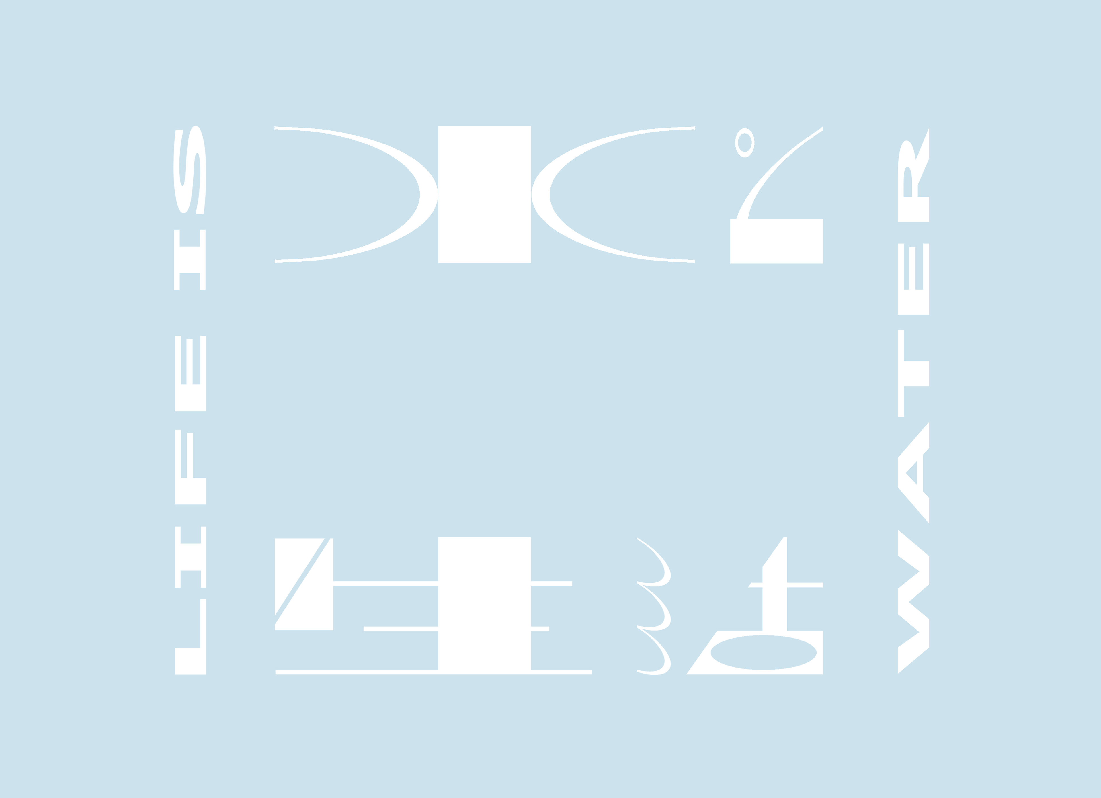
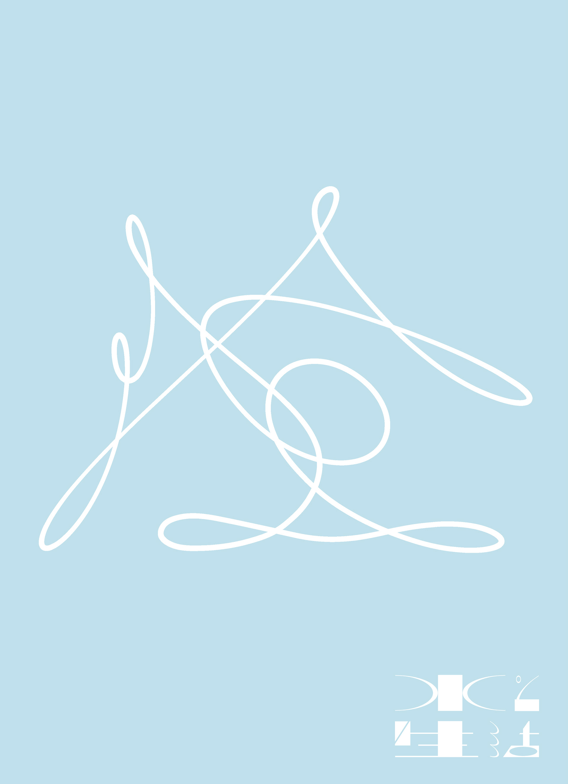
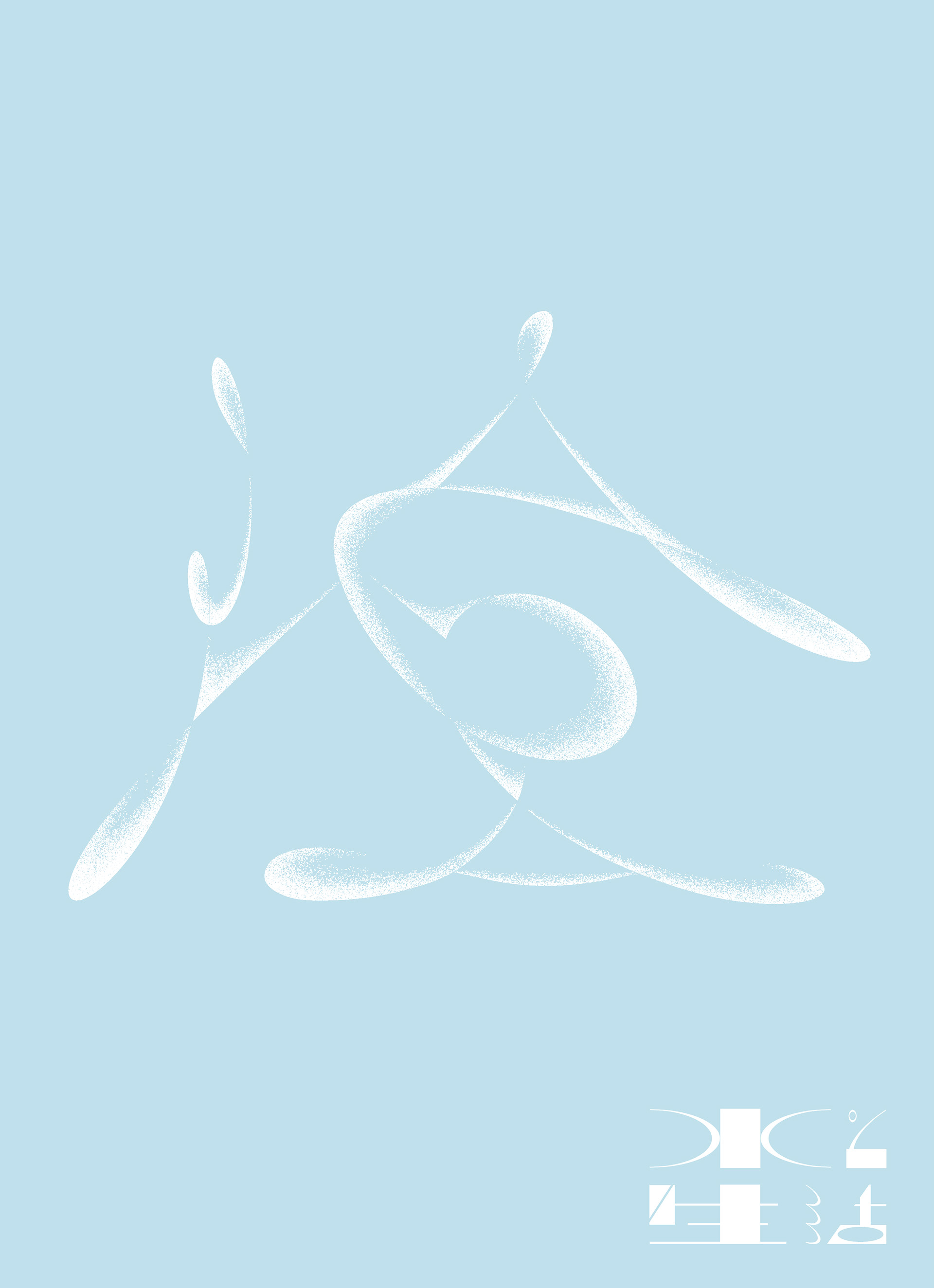
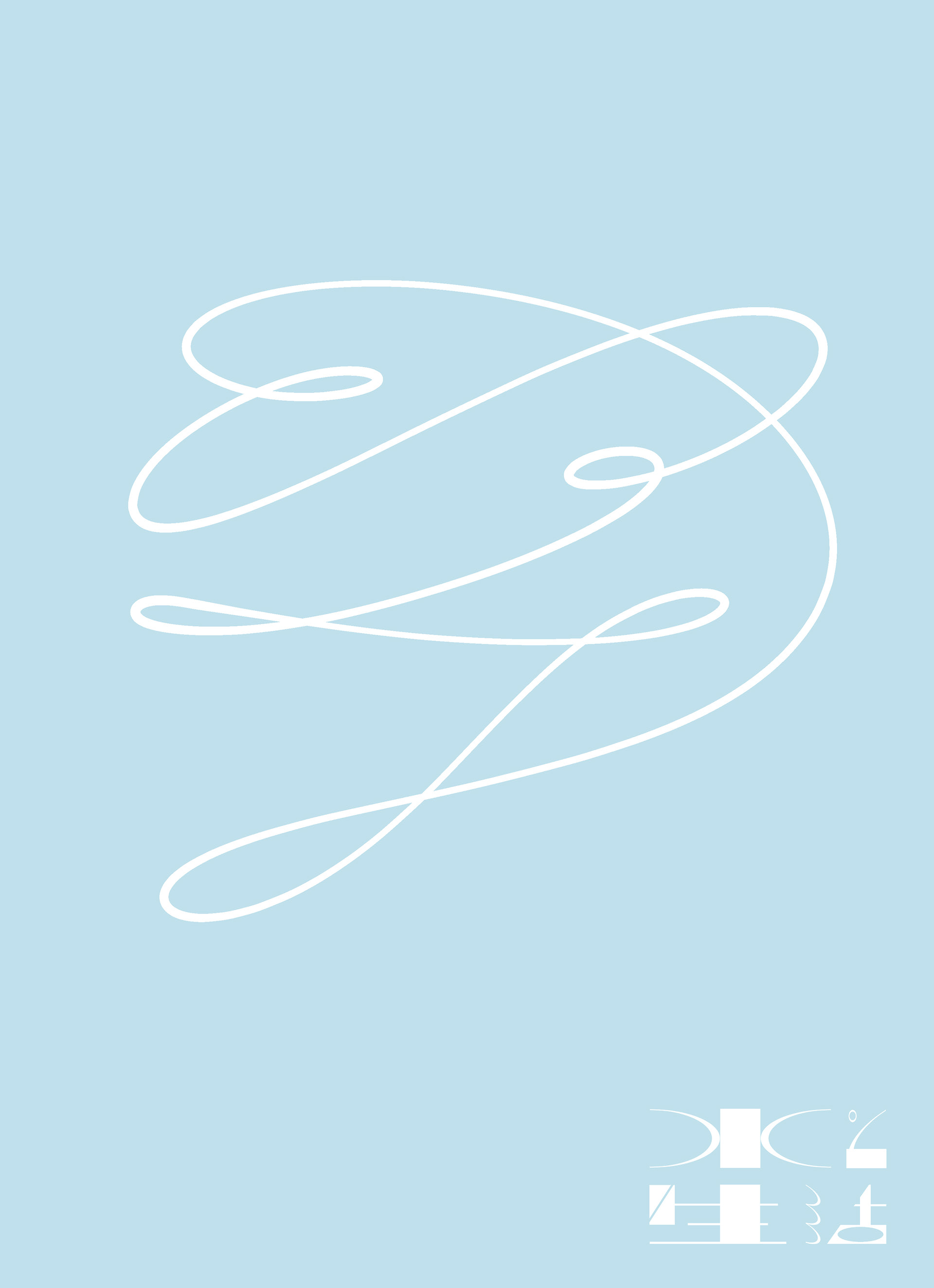
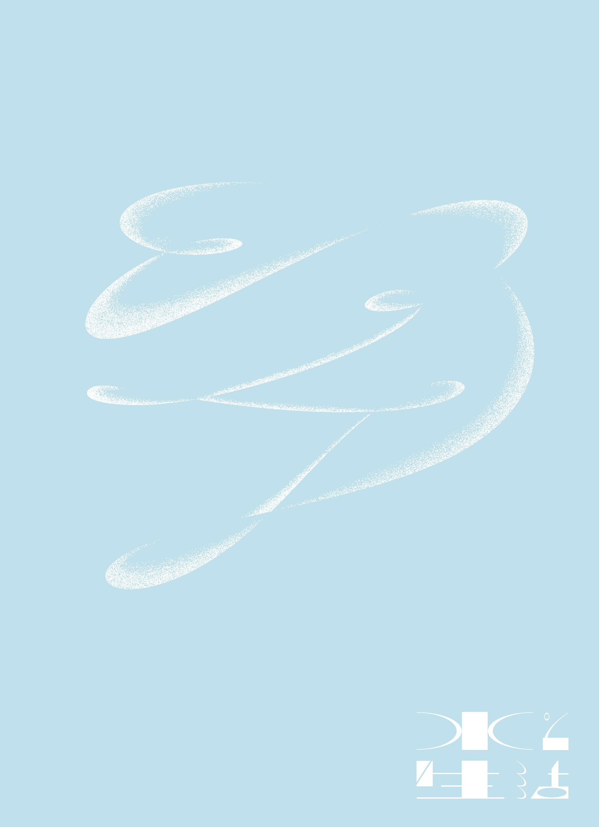
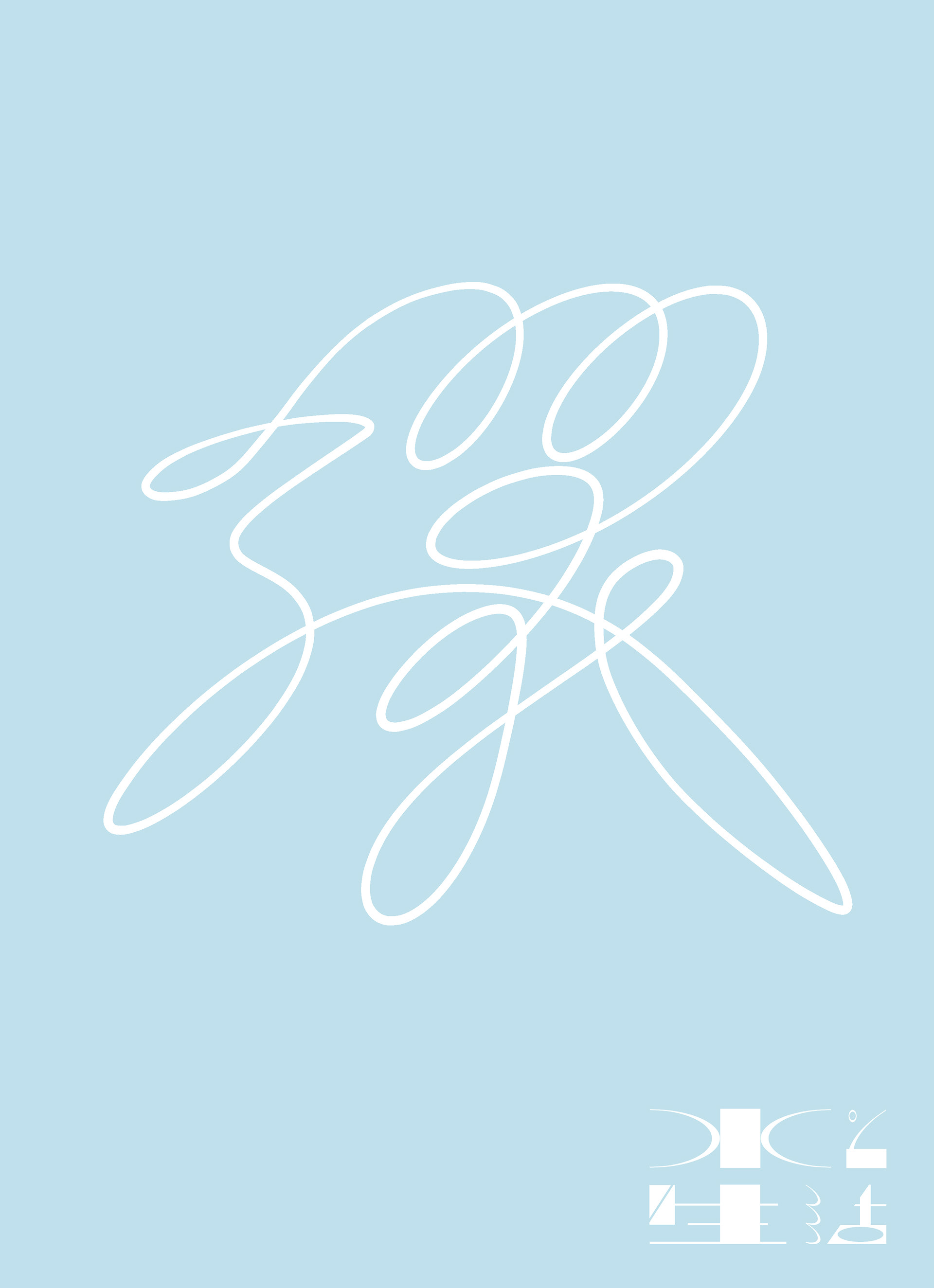
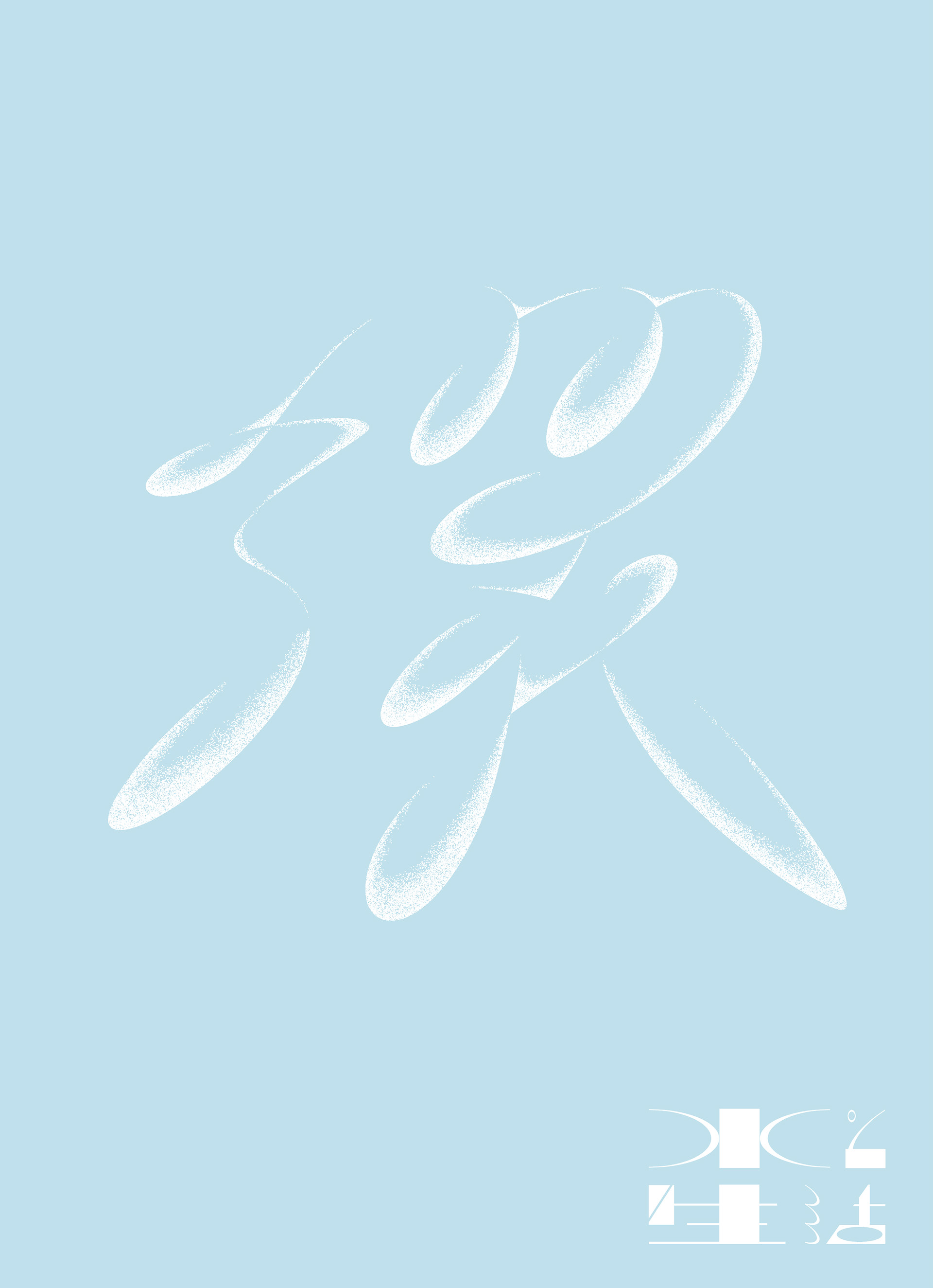
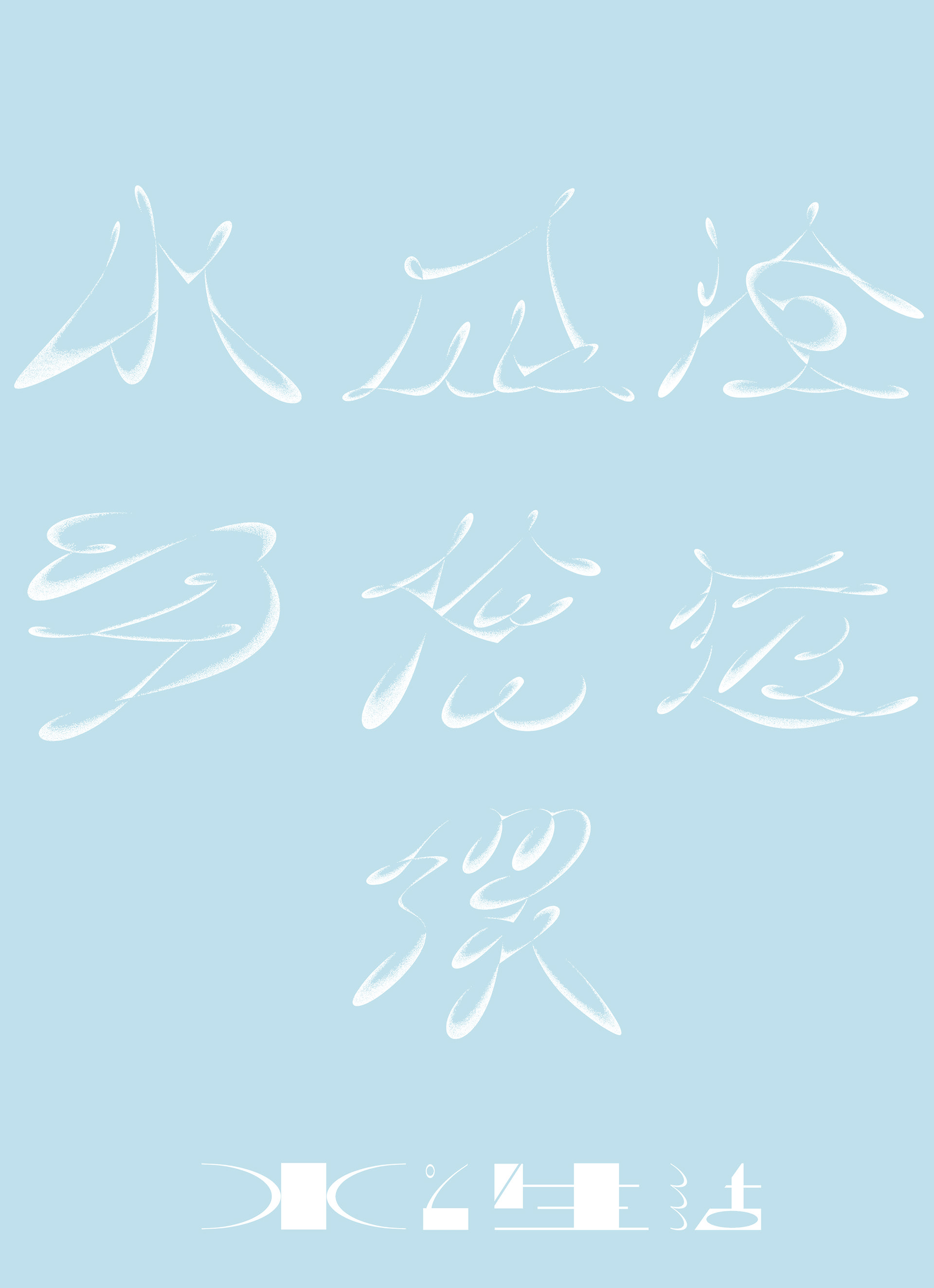
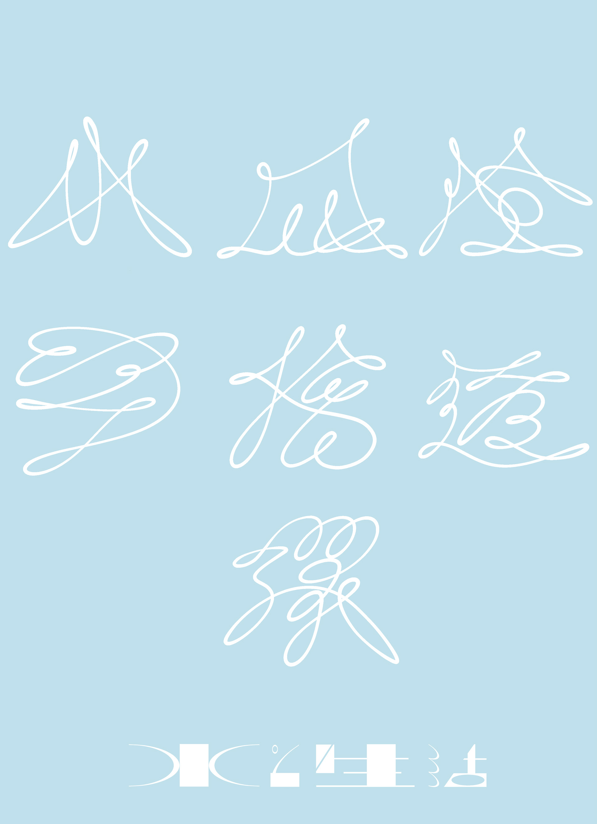
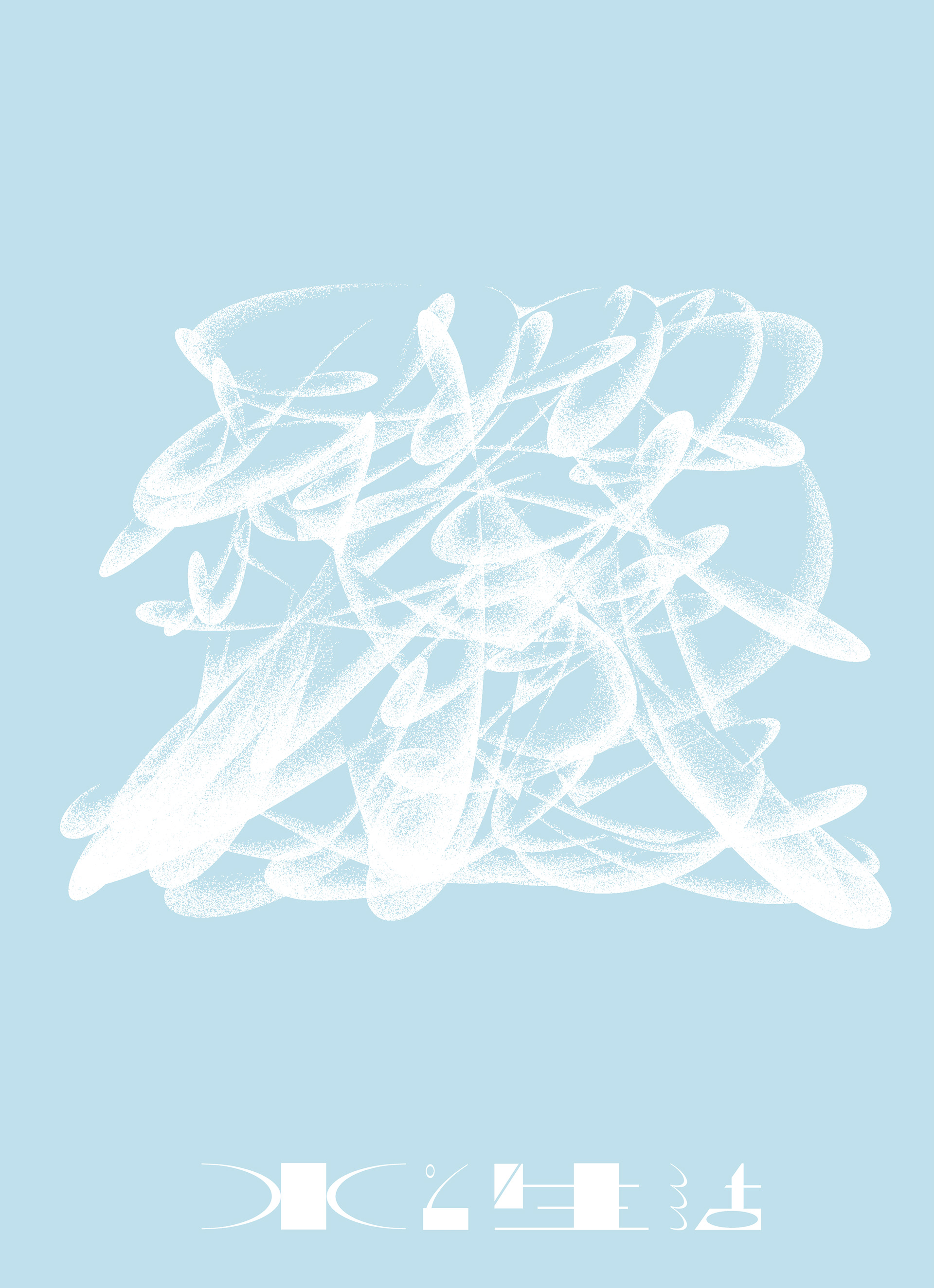
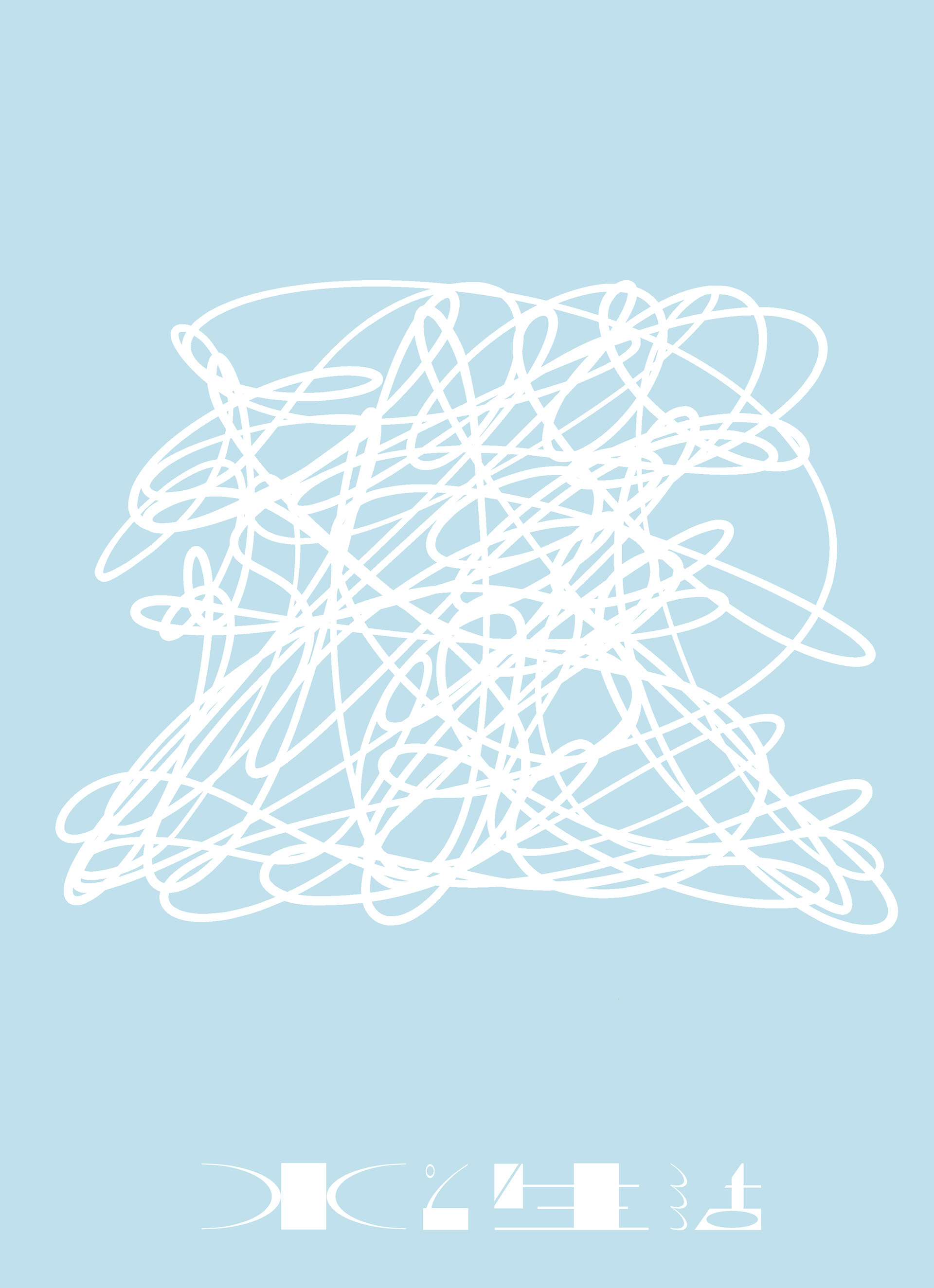
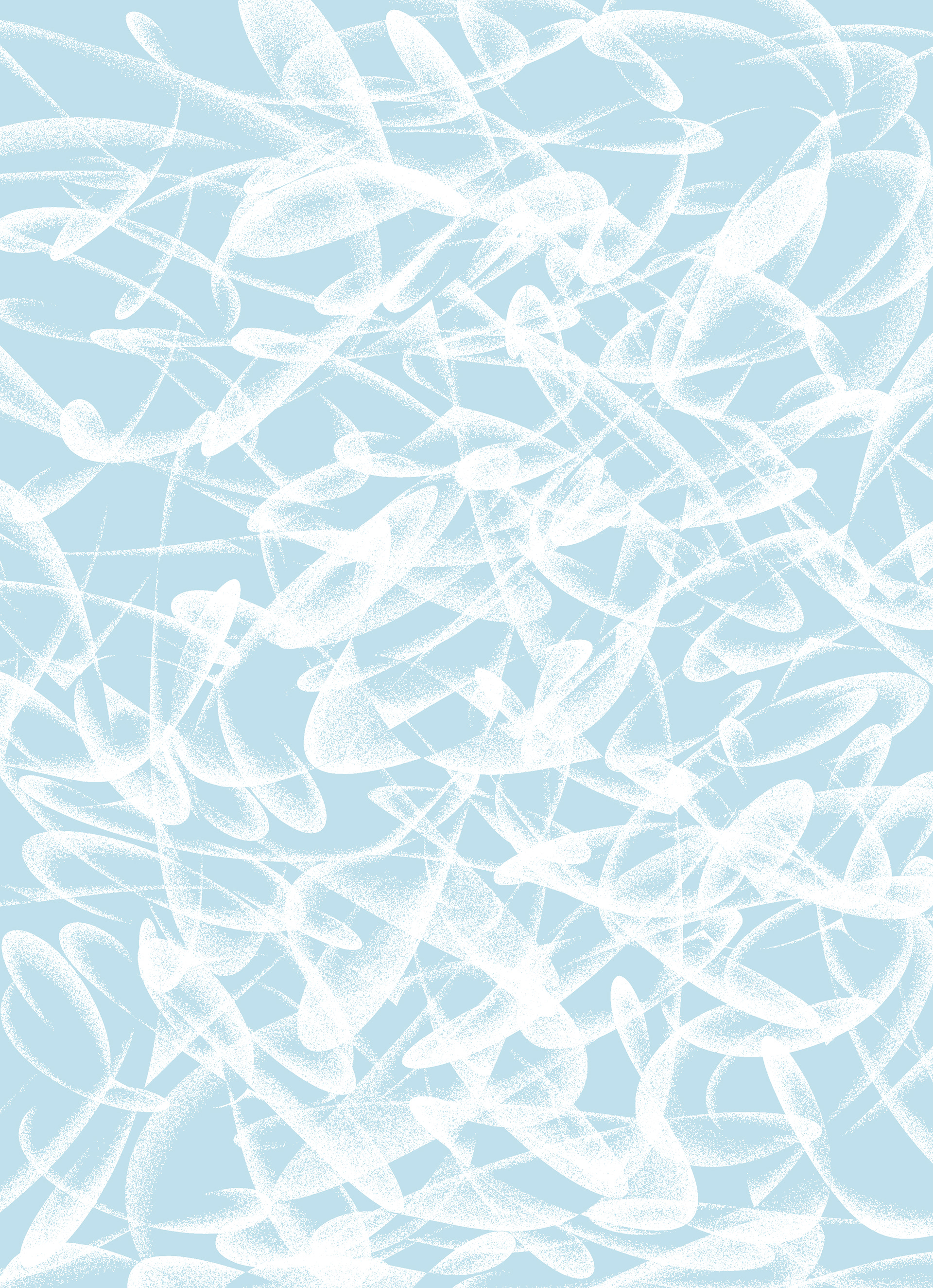
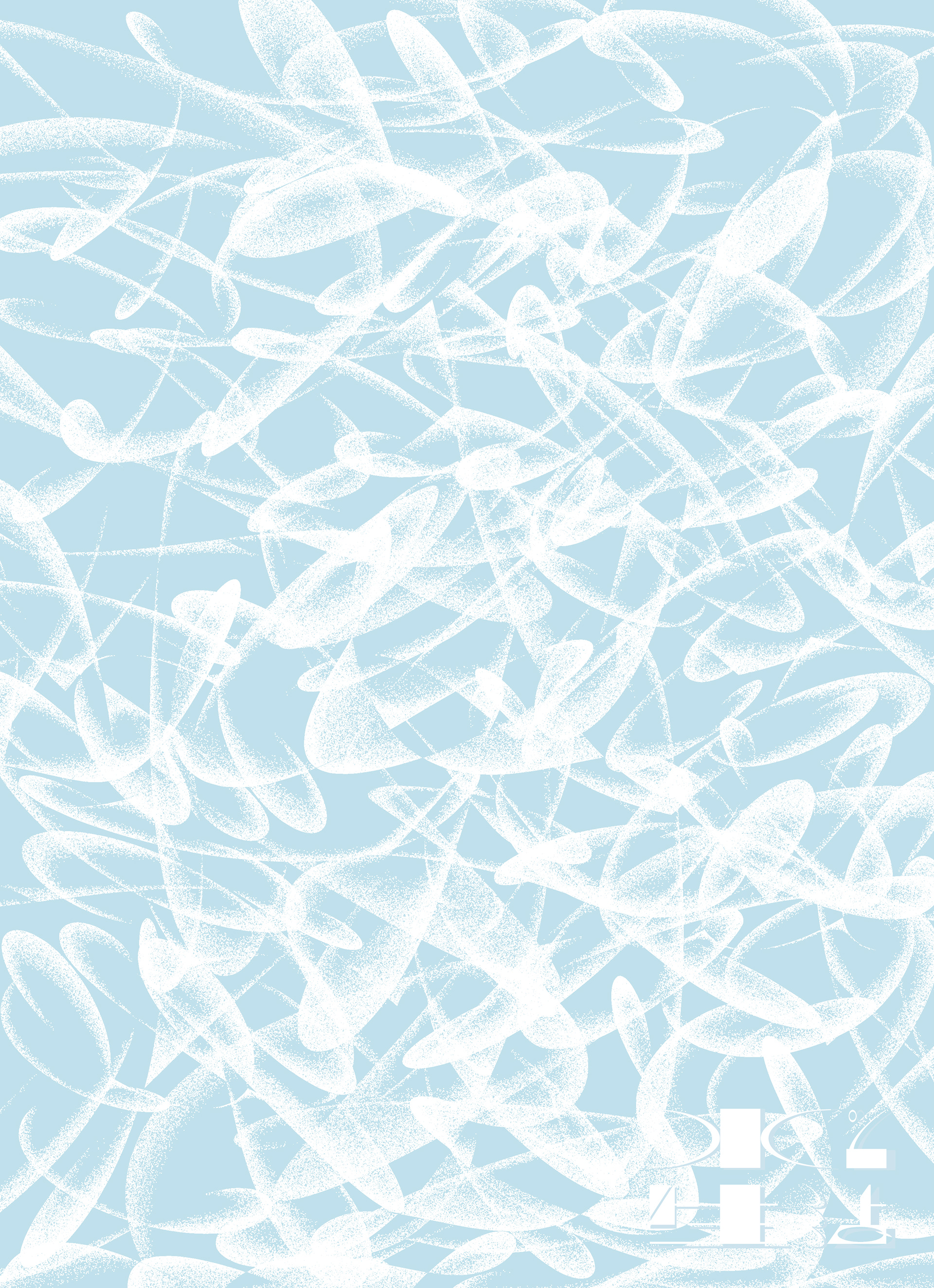
“Life is water”
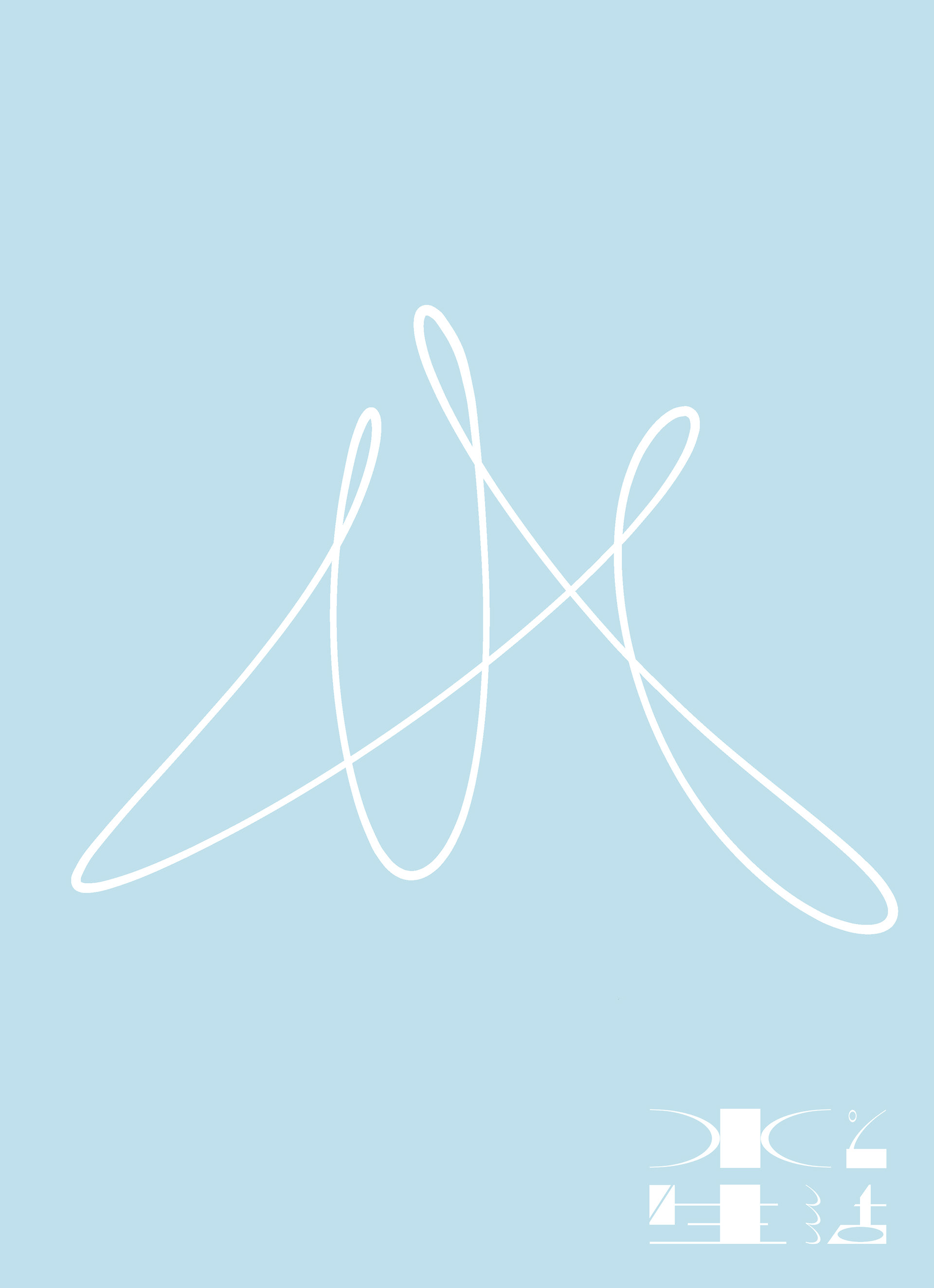
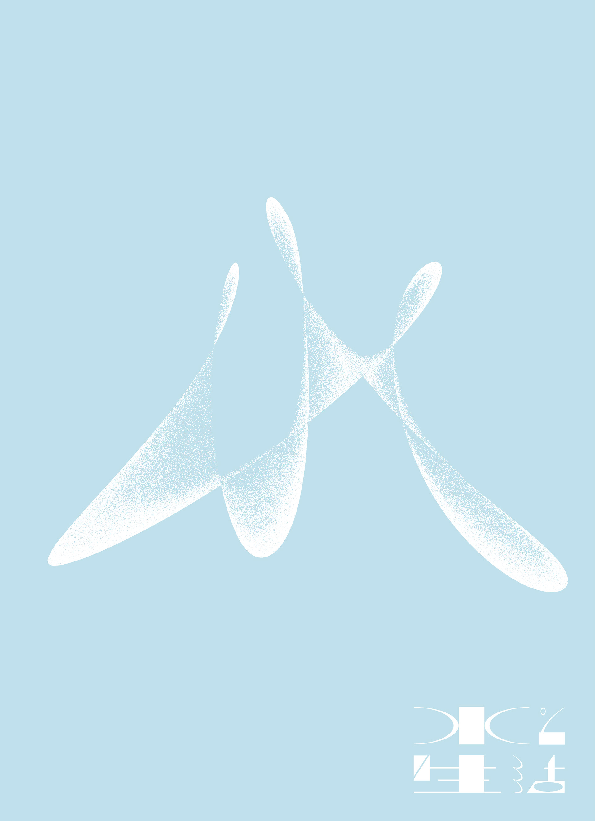
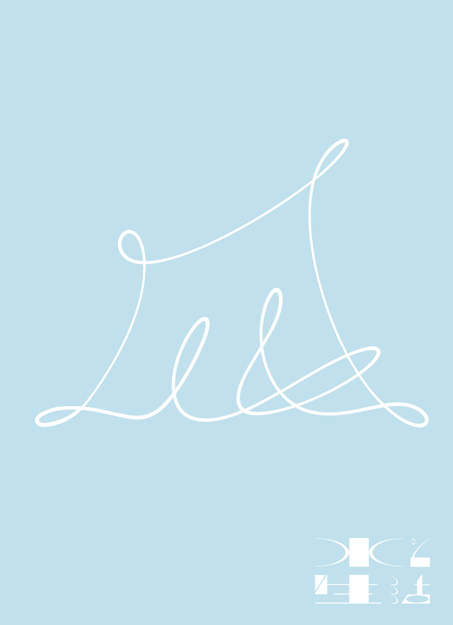
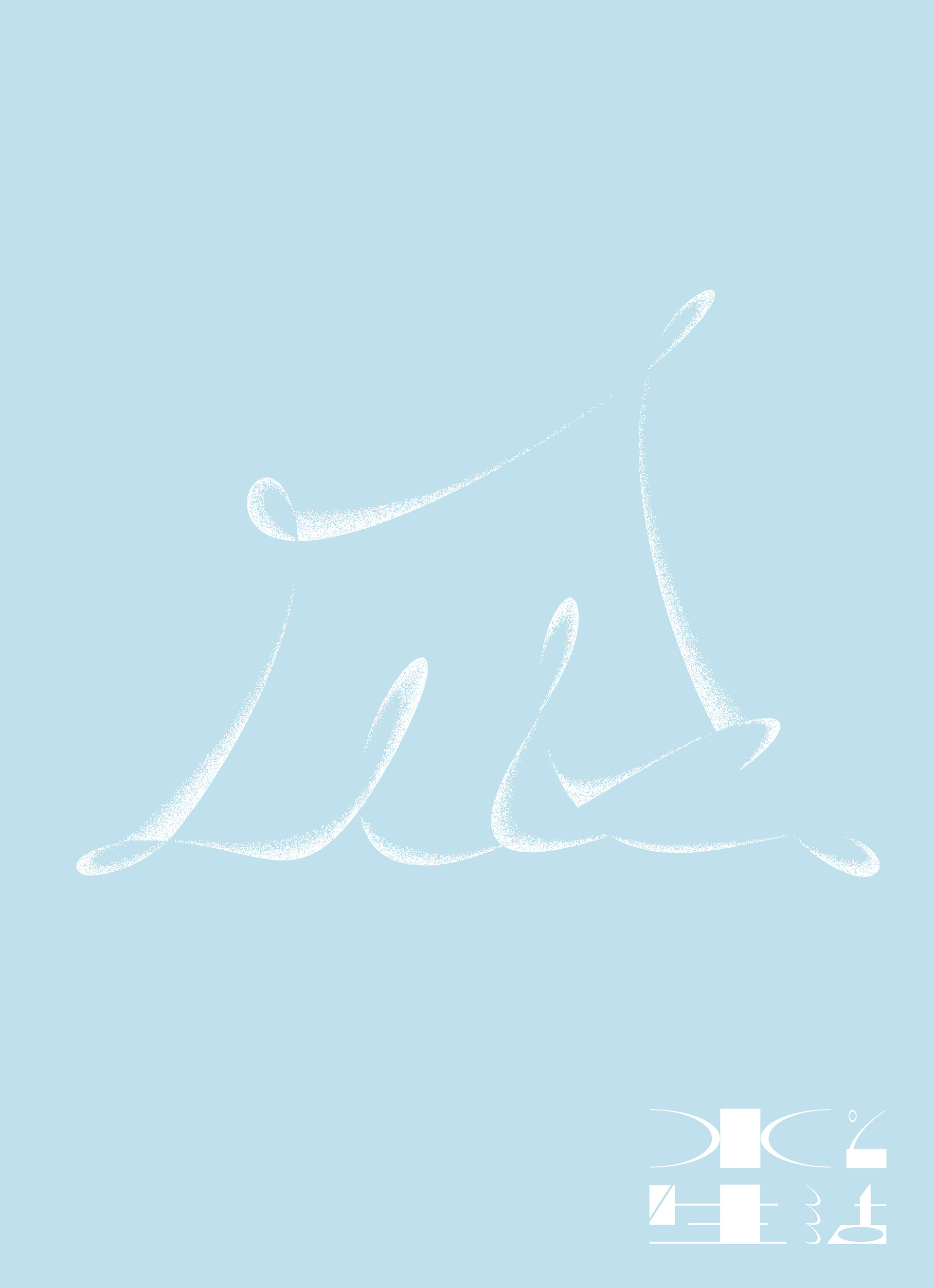
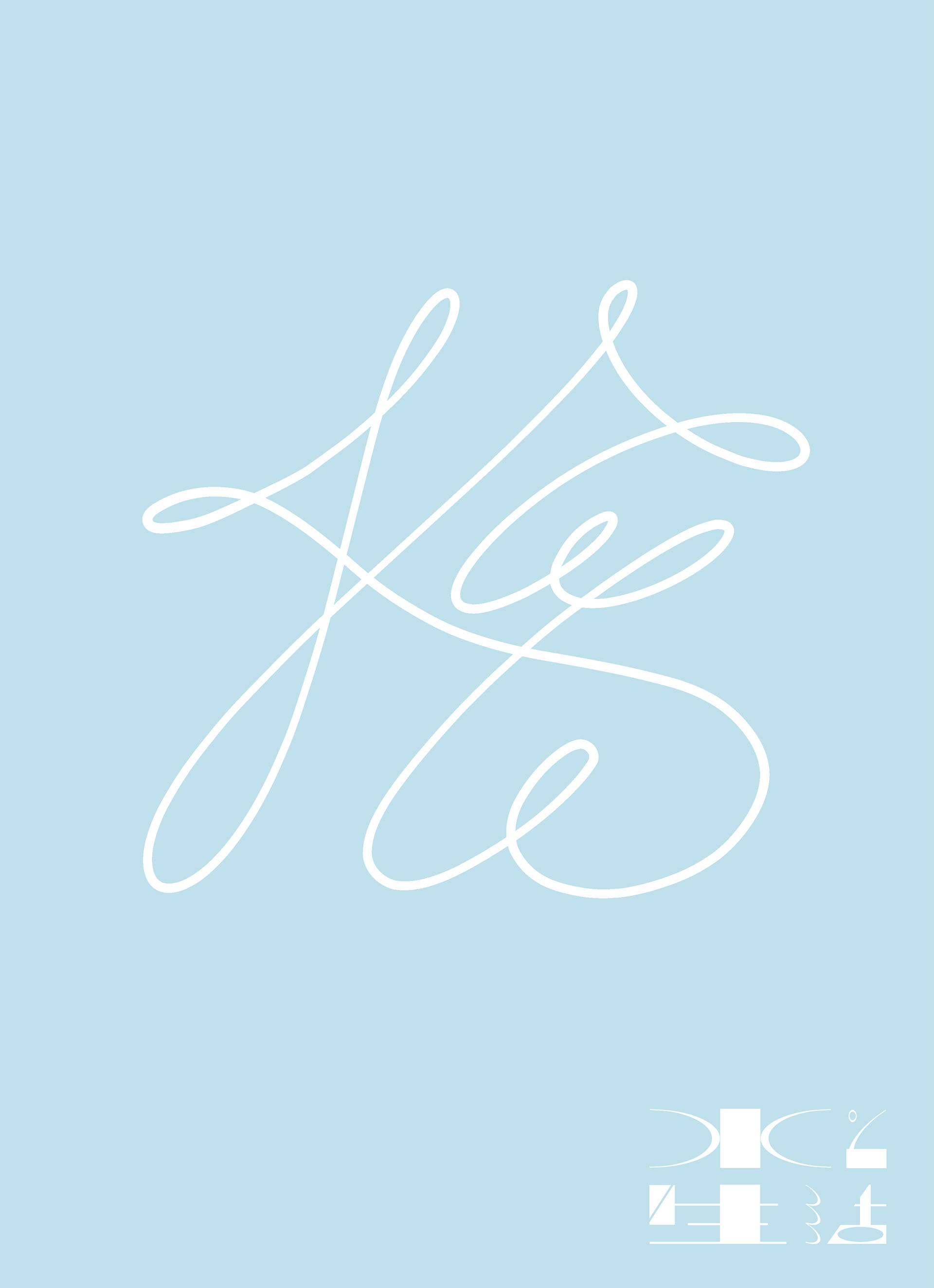
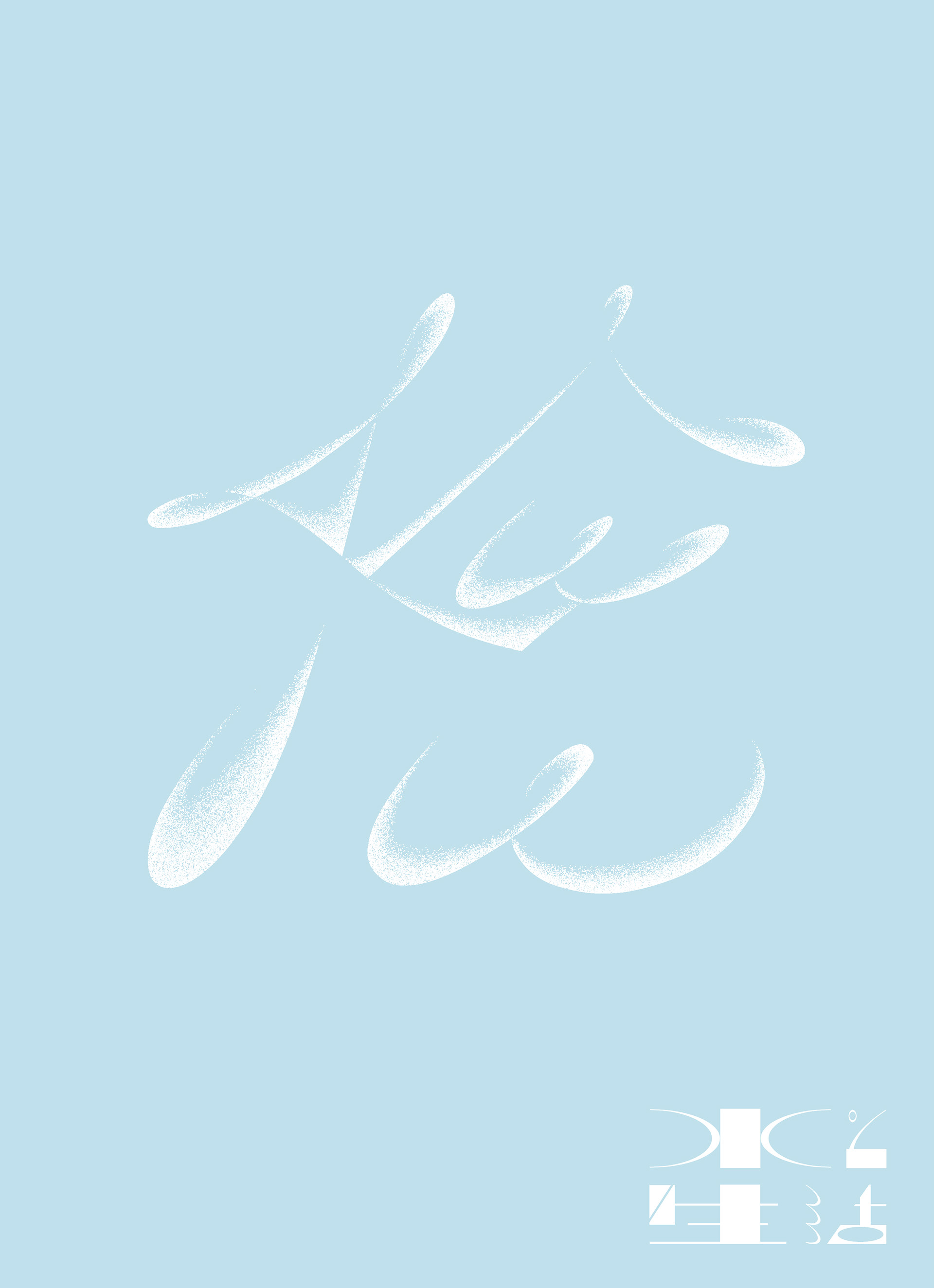
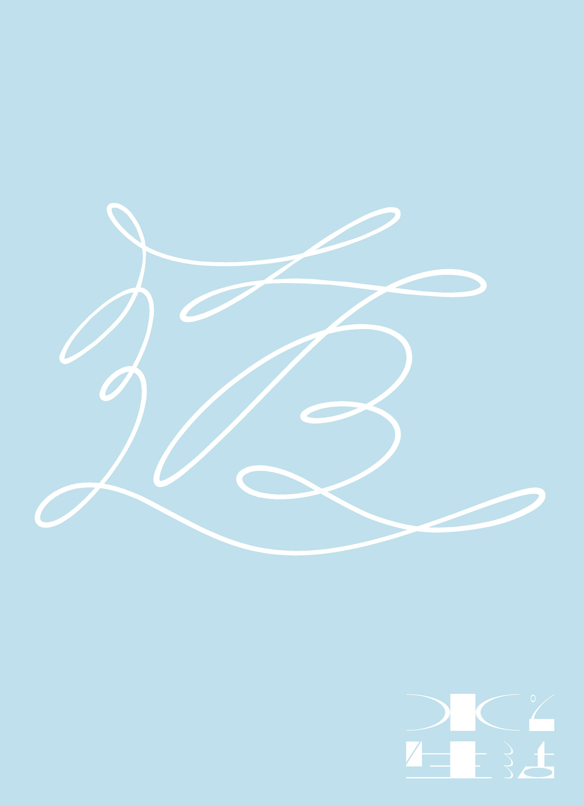
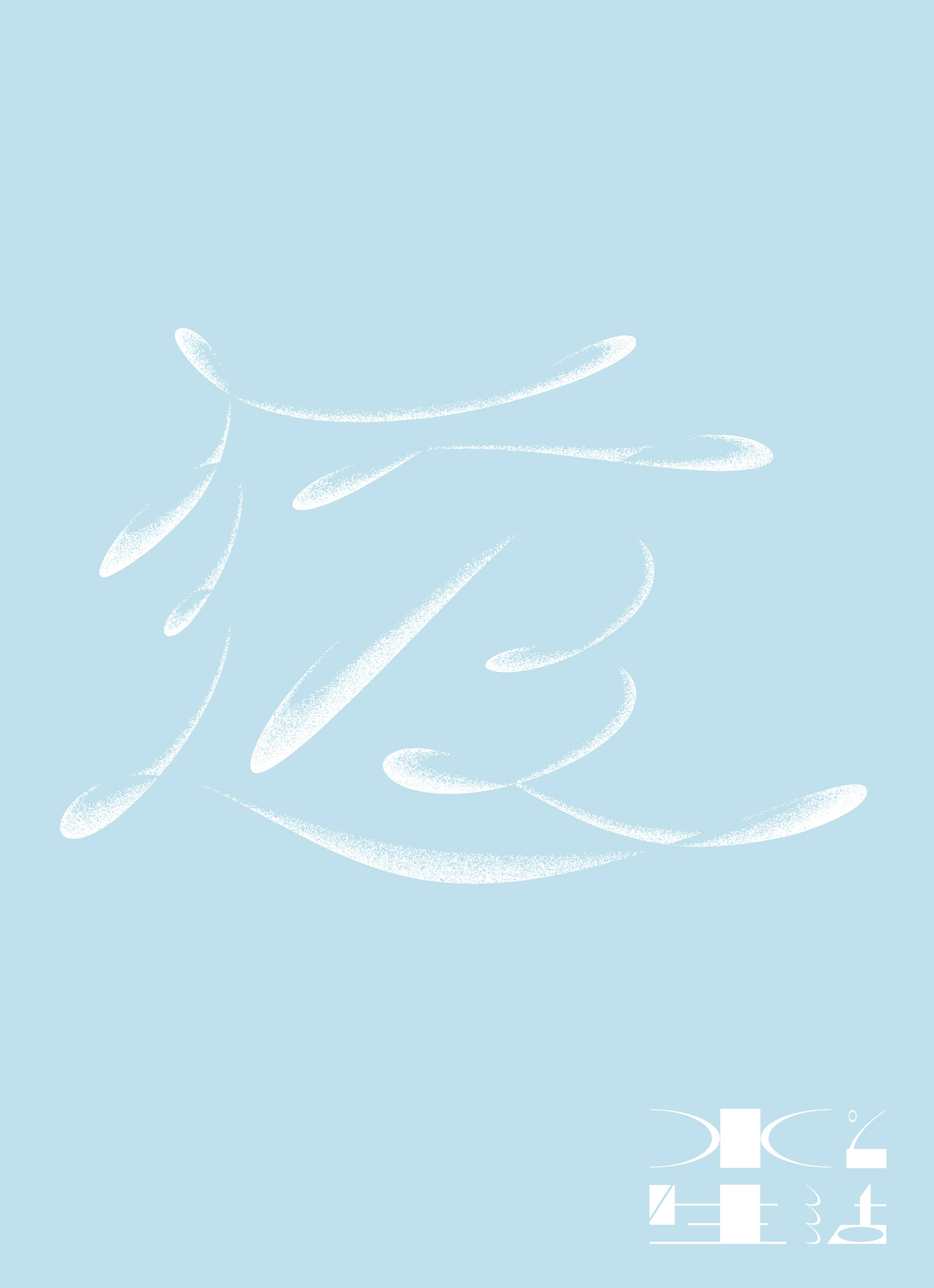
These are visuals of a event calling to attention the seriousness of the water situation. In this logo, I combined curve and straight line because I want to emphasize water curve. And And I designed some visuals used the shape of kanji related water.
“水と生活”
“水と生活”は、水に関わる環境の大切さを改めて喚起するイベントです。ロゴマークは、水の流れを表現する繊細な曲線とそれを強調する力強い直線を対比的に用いました。また、水から連想される「水、凪、澄、雫、橋、透、環」の文字をモチーフとしたポスターやそれらの組み合わせたパターンデザインなどを合わせて制作しました。